The Anatomy of a Great Screenshot
Matthew Guay
Mittwoch, 4. Dezember 2024
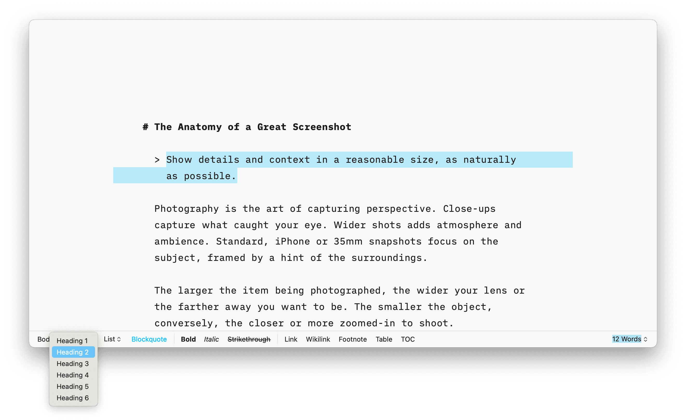
A great screenshot shows detail and context in a reasonable size, as naturally as possible.
Photography is the art of capturing perspective. Close-ups capture what caught your eye. Wider shots adds atmosphere and ambience. Standard, iPhone or 35mm snapshots focus on the subject, framed by a hint of the surroundings.
The larger the item being photographed, the wider your lens or the farther away you want to be. The smaller the object, conversely, the closer or more zoomed-in to shoot.
Only, that’s not a hard-and-fast rule with video, where such a wide field of vision may be unnecessary. You can pan around to show the setting, then pan back to focus on the details—something that only clicked for me, a photographer who rarely shoots video, after reading a comment about a wide lens. And it tied together what, to me, makes a good screenshot.
For screenshots are deceptively simple to take. They’re the default way we record everything from memes to bank transfers today. Yet the same way an iPhone photo of your parking spot isn’t a gallery-worthy photograph, the average screenshot shows either too little or too much.
You could focus solely on the details, screenshotting just the File menu to show the Print option. Or you could show everything, snapping your entire screen with more desktop wallpaper and whitespace than actual details.
I’ve shot thousands—perhaps millions—of screenshots, in over a decade of writing about tech for dozens of sites including Zapier and Wirecutter. CMD-Shift-4 may be my most-used keyboard shortcut. I’ve learned through shooting and editing software tutorials that all screenshots are not created equally.
The best screenshots show both detail and context. Screenshots are a photo, not a video. You need everything important in one shot—as naturally as possible. And you need to do it without eroding your privacy; computers and smartphones are our digital passports, after all.
How to take a great screenshot

What are you screenshotting?
How much do other people need to know about your screenshot subject to understand what you’re showing them?
Where will your final screenshot be used?
How balanced does your final shot look?
The answers to those four questions give you the ideal screenshot.
What are you screenshotting, and how much do other people need to know about the context?

Too much whitespace. An irrelevant menu. Bits of other windows poking out underneath. This isn't a great screenshot.
Sometimes, you only need to screenshot the content. Sharing a meme or photo from social media? Just the photo is enough. Sharing an email, or a social media post? Just the text is enough.
But perhaps you want to show the context. You want people to know this conversation was both an email, and received in the Basecamp team’s Hey email app. You want people to see the original post that accompanied the meme—and that it got a half a million likes. That’s when you should zoom out. Expand the screenshot. Not enough to show the entire apps’ interface, but enough to place it in context.
Other times, you need the entire interface—when writing a tutorial, showcasing an issue, or sharing something that requires more details for verification. Need to prove you’re actually a student by showing an attendance chart, or that you actually transferred the money from a real bank, or that the quote you screenshot came from a real publication? Zoom out again and screenshot the entire window. Everything matters, here—from the site or app’s icon to its footer. The additional details build context, and trust.
And then, rarely, you might want to screenshot your entire screen. Perhaps you’re having a system-wide issue you need help with, or you’re writing a tutorial about the Windows or macOS as a whole. Full screenshot it is.
What you almost never want is a full-screen screenshot of a single window on a large monitor. Say you want to show your entire new website design, and you have a large desktop monitor. You could open Chrome, go full-screen, zoom out enough to show your full site, and screenshot. Only then, there will be so much blank whitespace on both sides of your website, your design will be lost in the void. Better to screenshot only your website’s content, rather than shooting the full screen.
Where will your final screenshot be used, and how balanced does the shot look?
That brings us to size.
Because, no matter how much context you may want to show, sometimes you only have so much space.
On your blog, a reasonably sized full window screenshot makes sense. Twitter/X and other similar networks show photos in a 16:9 ratio if wide, or a 3:4 ratio if tall; a window that’s almost double as wide as it is tall will look the best, that or a phone-shaped screenshot. Facebook shows single photos as a 1:1, Instagram-style square by default; other shapes will have padding added. And that will change; social media is continuously in flux.
Raycast, a search-centric productivity tool for Macs, can resize your windows to a “reasonable size:” 2272 by 1854 pixels on a retina display—close to a 5:4 ratio. That looks nice for a writing app or web browser, but feels cramped for a wider, 3-column app like Mail or more complex software like Photoshop, where a 16:9 ratio shows more of the interface (where that same shape would have too much whitespace for a simple, one-column app, say).
Play with your window size. Shrink the window until it starts feeling too cramped, then zoom back out a bit to give the content and tools a bit of breathing room. You’ll know it when you see it. Don’t worry about the exact pixel size of your screenshot just yet; if your site requires images no wider than 1200px, you can resize it prior to uploading.
Then take the shot.
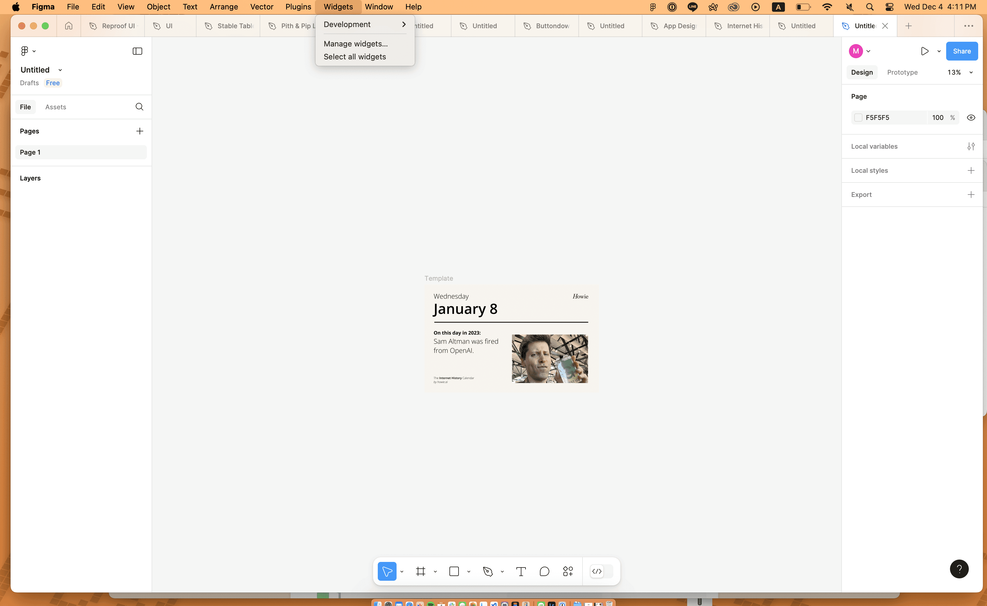
My personal preference, for software you install on a Mac or Windows PC, is to shoot the entire app—from the top border with close and minimize buttons to the bottom status bar. Need to show a Mac app with the menubar from the top of the screen? Drag the window right underneath that menu, open said menu, and screenshot the menu along with the software. I prefer to avoid including extraneous UI elements; avoid including scroll bars where possible for cleaner screenshots.
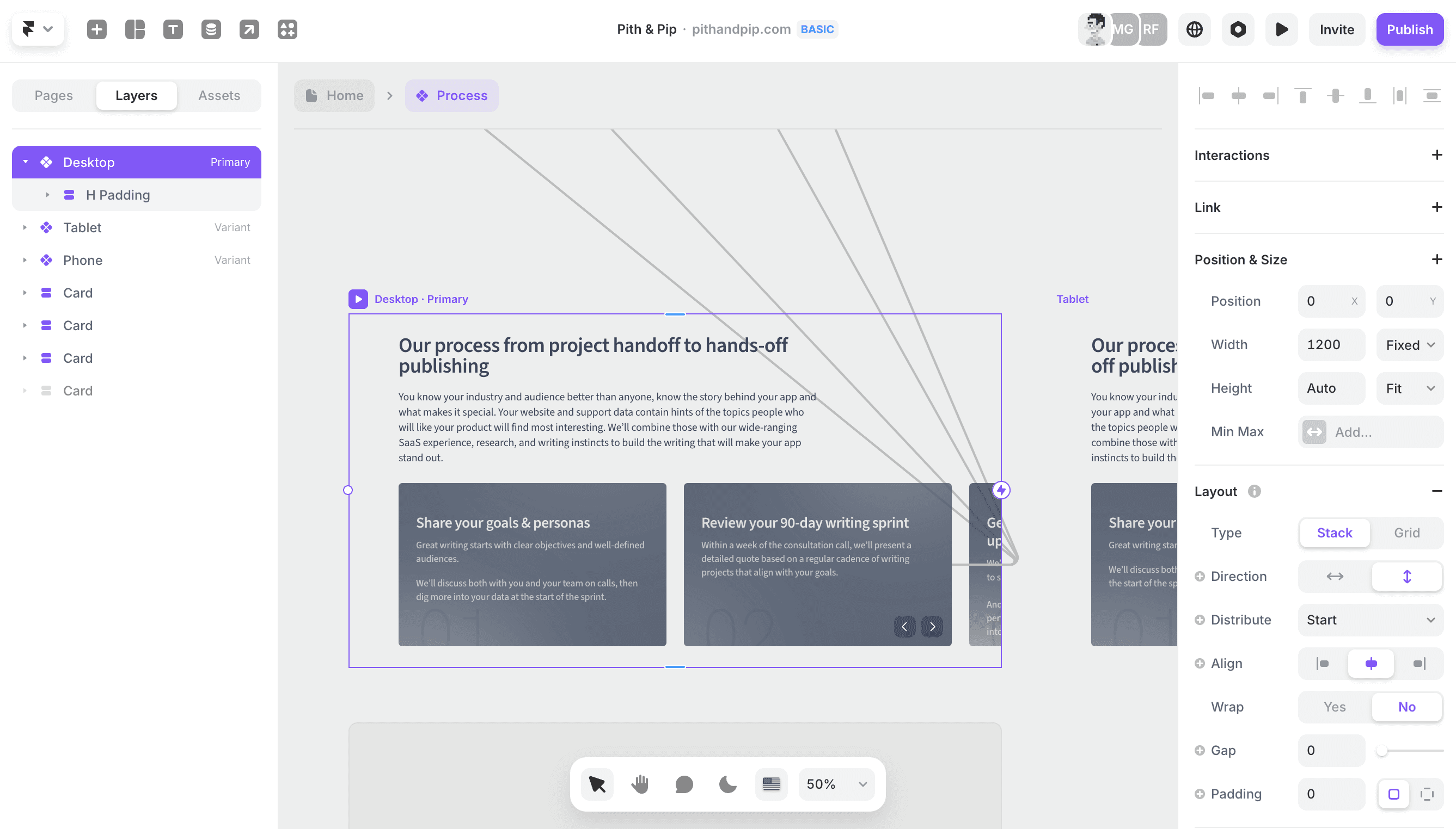
For web apps, the browser interface and tabs aren’t part of the app, so shooting the entire app means to screenshot the inside of the application without the window frame. If you’d like to include the window frame—with the window’s drop shadow, on macOS—then pull that tab out into a standalone window, hide extensions and toolbars for as uncluttered a browser window as possible, then take your screenshot.
For mobile shots, the full screen is typically best, perhaps cropped enough to remove the time, battery, keyboard, and home indicator—but leave any of the app’s own navigational bars.
Watch for everything that will distract and detract from your shot. Avoid broken lines of text, clipped toolbars, extraneous open panes and cookie notifications, and similar bits of clutter or cut-off details. Beware of rounded corners; better to crop in a bit and miss a bit of the edge of the interface than to have an odd black triangle in the corner of your screenshot.
Should you annotate your screenshot?
Annotate your screenshots for one-on-one interactions. If you’re emailing support about an issue, or replying to someone’s query about how to do something, screenshot your full window and add arrows and text to your heart’s content. Brevity and clarity trump aesthetics, here.
For published screenshots, my preference is to annotate naturally the same way you highlight on a computer. If you’re screenshotting a button or menu option, hover over it with your mouse then take the shot. Sharing text? Select the text to highlight it, then screenshot.
Alternately, take either multiple screenshots or a video. With multiple screenshots, first show a full window, then take a closer crop that shows the UI elements you’re interacting with, followed by a final shot that again shows the full window
Should you blur or delete info in screenshots?
You should always remove private, identifiable information from your screenshots when sharing them publicly. The best way is to either delete the data entirely, or to edit the info into something generic.
The latter is my preferred option, especially in web apps where you could use Inspect Element to tweak the HTML and change your name into “User 1” or something else generic (here’s a guide: How to use Inspect Element to edit text in web apps).
When that’s not possible, take the screenshot, then delete the section with identifiable data in your favorite image editing tool. Do not blur the text; it’s possible in cases to unblur data, at least enough to guess the underlying text. Instead, either delete it with a solid color box and save as a JPEG or PNG image, or use a tool like Photoshop’s Generative Fill to replace the text with a plausible blank space that looks like the rest of the app.
Only include private, personal information in screenshots if they’re being sent directly to trusted parties. Emailing support about your issue? Private info in your screenshot is expected if it’s important in helping the team decipher what’s wrong.
All other screenshots should always be checked for private info before sharing. Your account name and avatar may not be an issue, but you may not want your personal email address, account numbers, location, and more included in images that anyone can see online.
Would a screencast be better?
Some things are better to show in action—and there, the wide-versus-standard-lens photography divide applies. You could use a screencasting tool to show your full screen, then zoom in on the area of importance, then zoom back out to show what happened. And you could then publish that as a video or a GIF.
It can work well, especially for publishing detailed documentation, but takes significantly more time to shoot and edit. And, perhaps most importantly, it requires far more care in timing, so you don’t waste your viewers time waiting for the screens to load and for you to figure out what you’re doing.
When shooting a video instead of a screenshot:
List exactly what you want to click and add in your screencast
Run through the steps first, so you’ll do everything fluidly while shooting the screencast
Have your screen recording app show your mouse, if possible, so viewers can easily trace your action
Follow screenshot guidelines: Show just the single app, resized to not show too much white space, and hide personally identifiable information or note where you’ll need to edit it out in post
Trim any loading and wait times in your recording, where possible
Reduce the file size as much as possible, especially when sharing as a GIF.
Pull it all together

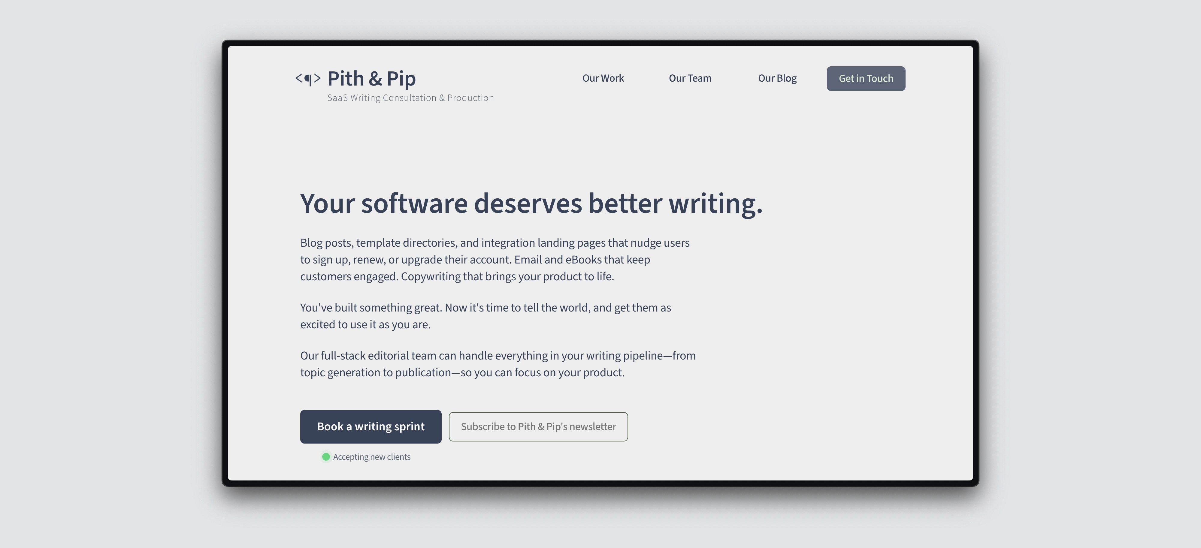
A web app, without browser UI, scaled just enough to show the UI without too much whitespace. A decent screenshot.
So.
Think first about where your screenshot will be published and what info you need to showcase.
Resize your window appropriately.
Remove personally identifiable info, or make a note to delete it from your final image.
Highlight naturally, with your mouse hovering over the correct element or with important text selected.
Take the screenshot, taking care to capture the entire window—don’t miss any of the toolbar or cut off one side, or go too wide and screenshot your wallpaper, too.
Make any final edits: Remove any personal info, resize as needed for the platform where your image is to be shared, and optimize the image if needed.
And, along the way, learn your platform’s default keyboard shortcuts for screenshots:
macOS and iPadOS with a keyboard: CMD+Shift+3 for fullscreen, CMD+Shift+4 for a section of your screen, CMD+Shift+4 then space for a full window.
Windows: Windows+Prnt Scrn for fullscreen, or Windows+Shift+S to open Snipping Tool for more precise shots.
iOS: Power+Volume up
Android: Power+Volume down (may vary depending on your device manufacturer)
Then screenshot away ... and ideally, organize them so you can find them easily later rather than searching through endless Screenshot 2024-01-01 at 1.09.15 PM.png filenames (something I still haven’t mastered).

